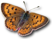
 Art Shapiro's Butterfly Site
Monitoring butterfly populations across Central California for more than 35 years… Activity
How do changes in weather affect butterflies?
In the activities described below, you will learn how to take scientific data and interpret it to answer that question. The data that you will download comes from a study that was published by researchers at the University of California, Davis. You may read all or part of the study when you are finished -- but first you will make discoveries on your own.
One of the scientists involved in the study from UC Davis has been doing research on butterflies in Northern California for more than 35 years. Over the course of those thirty-five years the scientist has made many phenological observations. One kind of observation in particular is our subject here: the dates of first spring flight of butterflies. These are dates when the first individual of a butterfly species is seen in the Spring. Remember that most (but not all, as you will see) butterfly species spend the winter in the Northern hemisphere (where winters are cold) as eggs or larvae or pupae -- and then emerge as adults when temperatures are warmer in the spring or summer.
If the date of first spring flight of the species Papilio Zelicaon is March 15 in the year 1999, that means that at least one individual was observed on that day -- and that was the very first individual of that species that had been observed since the start of that calendar year (Jan 1, 1999). The butterflies and observations that we're going to deal with here come from Northern California, in the Central Valley, in three counties: Yolo, Solano, and Sacramento Counties.
Why make observations on the date of first flight? We focus on the date of first spring flight because other scientists, particularly in England, have shown that the timing of early spring events (such as flowering in plants or migration in birds) is particularly sensitive to changes in climate from year to year. For example, in a year with a warm winter, plants may flower earlier in the spring. In addition (and this is really why phenology is relevant to climate change), long term trends in weather may be reflected in long term trends in phenology. Thus a series of increasingly warm winters may result in plants that flower increasingly early in the spring.
Activities
In the activities below you will download phenology data and weather data. You will create plots of the phenology and weather data to ask questions about changes from year to year, and about the relationship between butterfly phenology and weather. In order to do these activities, you need to have a couple of skills for dealing with data (skills will be detailed in a Methods Manual).
NOTE: it is important to do these three activities in order as they build on each other.
I. Butterfly phenology
As discussed previously (see CLIMATE AND BUTTERFLIES), the life cycle of a butterfly may be sensitive to small changes in the weather. Before we look at weather data or look at how weather data relates to butterfly phenology, we need to get to know the butterfly phenology data.
Below you will see a link that will take you to a page with 23 different butterfly species which all live in the Central Valley of California. Click on a few of the links just to get to know the butterflies and read a few things about them (clicking on the name of the butterfly will take you to a page about the butterfly; clicking on "DATA" will download phenological data, but read below before doing that).
Your task will be to choose one of the 23 species and investigate its phenology. More specifically, you will ask if there have been trends in the observed dates of spring flight. What do we mean by a "trend"? A trend in this case means that a butterfly has been observed to be flying either earlier or later over the years.
Why do we care about trends? We mentioned above that long term changes in climate (like warming temperatures) may be reflected in long term changes in animal or plant phenology. Before we think about weather data, we want to first understand our butterfly data, and asking about trends through time will prepare us for analyzing weather data and the relationship between weather and phenology.
Here is an example (this is hypothetical data, you'll look at real data soon):
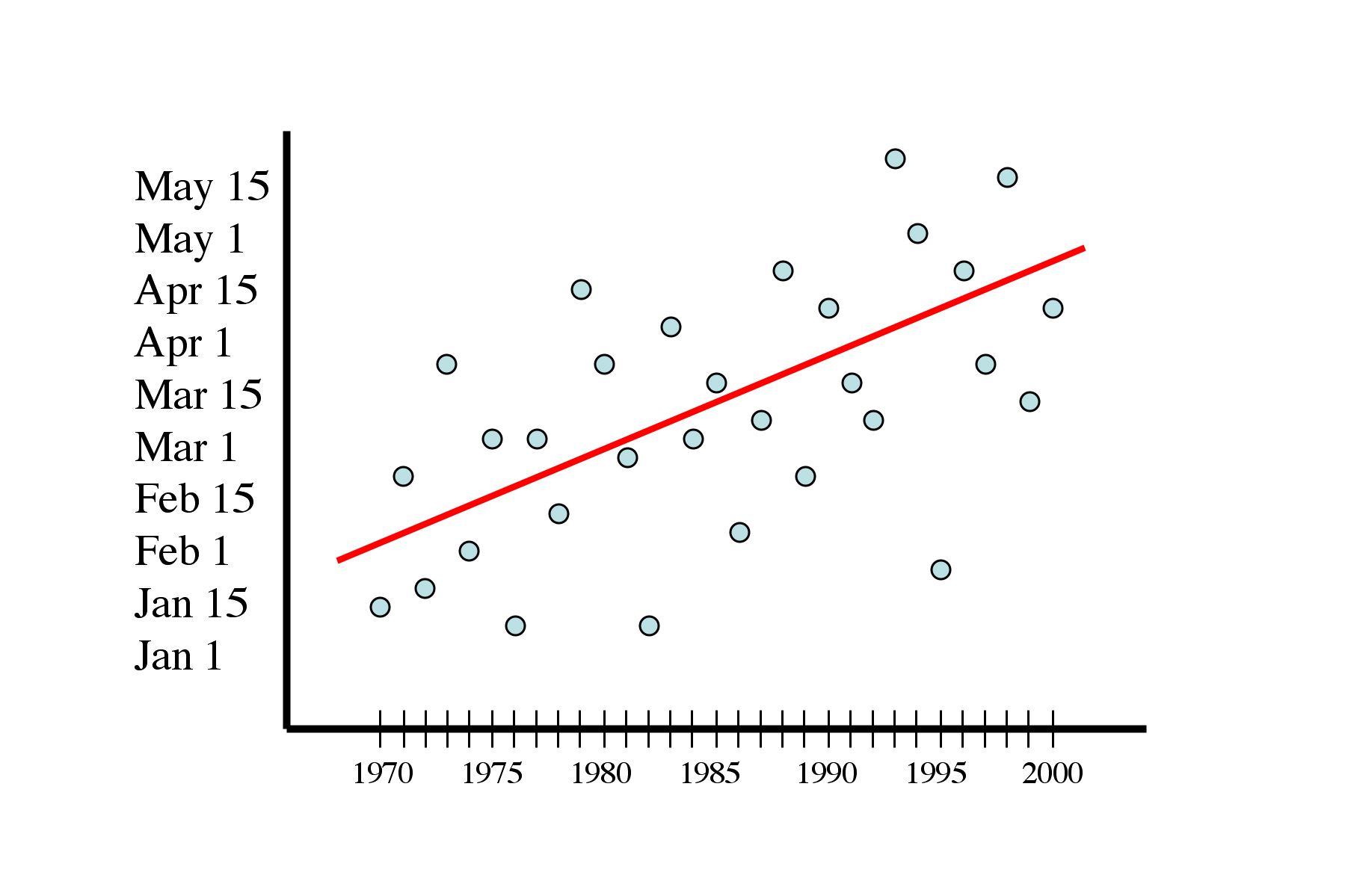
Each blue dot represents a single observation and indicates the date on which this hypothetical butterfly was first observed each year. For example, in 1976 at least one indivdual was seen on Feb 15. In 1982, the first individual was seen on the same date. The red line shows a trend through time. From the way the red line slopes up to the right, we can see that this butterfly has been emerging later over the course of the three decades in which observations were made.
Here is another example from another hypothetical butterfly:
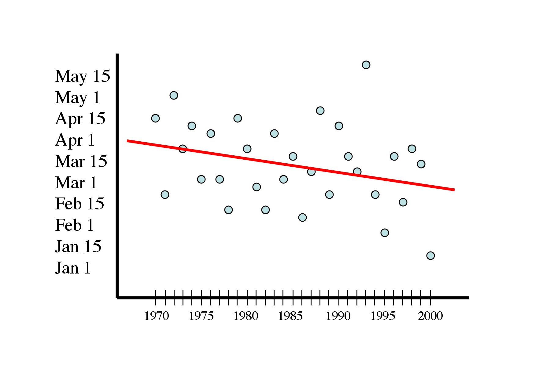
In this graph, you can see that the line is sloping down to the right (although the slope is not nearly as steep as in the previous graph). It slopes down to the right because there are observations in later years with values lower on the y-axis... does this mean that this butterfly has been emerging earlier? How steep does the slope have to be before we can say that a butterfly has been emerging either earlier or later?
This is an issue that will be covered when you read the methods manual, but for now it is important to be sure that you understand graphs like the ones above before going on. If you are confident you can read the graphs, then it is time to make one of your own, and do the following:
- Pick one of the butterflies from the list above (there is no right or wrong here, but the next activities will be more interesting if you read about a few of the butterflies before choosing).
- Click on the "DATA" link next to the butterfly you have chosen. A file should download that contains two columns of numbers, one a list of years and one a list of dates (the unique dates of first spring flight that were observed for your butterfly for each year). The dates you see in the data file are not what you expect -- they are coded in a particular way to make them easy to analyze. Days of the year are numbered from 1 to 365. So March 11 is coded as the number 70 (that's 31 days in Jan + 28 days in Feb + the 11 days in March).
- Make a graph of the dates of first spring flight versus years. This will be set up much like the graph above, with the exception that the y-axis will be numbers not dates for the reasons just discussed (see step #2). A complete guide to making the graph is provided in the Methods Manual.
- Finally, answer these questions:
- Has your butterfly been emerging earlier or later (or neither) over the years in which observations were made?
- What do you think might explain the pattern that you see with your butterfly data (thinking particularly about climate)?
II. Weather patterns
Now that you have looked at the phenology of a real butterfly, it is time to look at some real weather data. Below you will see a link to weather data -- which come from a weather station in Northern California, in the same area where the observations of butterfly phenology were made.
The next task is very similar to the last: download the data from the following weather query (linked below) and make a graph just like you did with the butterfly phenology observations (with years on the x axis and weather observations on the y axis).
Then answer the following question:
- Has there been a trend in the weather over time?
III. Phenology and weather
You have looked at butterfly observations and weather, now you can put them together to answer the big question: how does weather affect butterflies? Consider the following graph:
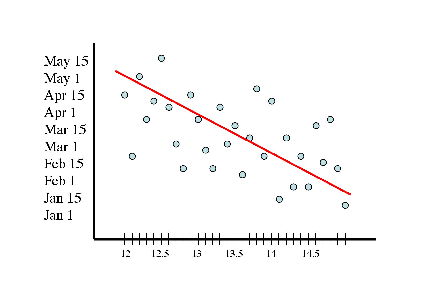
The x-axis is now degrees Celsius, rather than years (the Celsius here refers to the average daily temperature). Each point, however, is still one butterfly observation from one year, and what this shows is a relationship between date of emergence and the warmth of the year. In warmer years, this butterfly was observed earlier. This suggests that temperature may have a strong influence on this particular (hypothetical) butterfly.
The final task is to take your butterfly data and the weather data you downloaded and make a graph relating date of first flight to weather, and answer the following:
- What have you learned about the relationship between climate and the butterfly species?
- Why do you think a butterfly species would be influenced by the climatic variable you studied?
We have suggested some answers to this already (and one of the questions above was similar), but you may need to speculate, and you may need to do some more reading about the biology and life cycles of butterflies.
Finally, compare the graphs you have made with graphs that other people have made from different species and answer the following:
- Are there any phenological patterns that are common to a large number of species?
For example, are more of the species emerging earlier through time or later, or neither? - Are there any common patterns in the way species respond to the climatic variables?
For example, does winter rainfall affect the first spring flight of all the butterfly species in the same way? - Review the biology of the butterfly species that you picked, and consider how it is different from other species. What are some biological properties that could explain why one species responds in a certain way to weather while another species responds in a different way?
- You have looked at three kinds of patterns: (1) trends through time in butterfly phenology, (2) trends through time in weather data, and (3) the relationship between butterfly phenology and climate. Does the behavior of the butterfly (the phenological pattern) make sense in light of what you learned about the weather and about the influence of weather on your particular species? Do your best to discuss how you think the different patterns might relate to each other.
The last question is the most difficult, and if you feel that there is not a clear-cut answer, you might be right! Remember that you have been dealing with real scientific data -- which can be a very complicated thing.