 Art Shapiro's Butterfly Site
Monitoring butterfly populations across Central California for more than 35 years… Methods
There are three main skills that you need to complete the activities. The first two involve making graphs of data, and the last one involves a statistical analysis. The last topic is advanced, and may include information that you have not encountered in your math classes.
This page is written with the program Microsoft Excel in mind. If you don't have access to Excel, other spreadsheet programs will be able to do the steps in parts one and two (you may have to skip part three, unless you can use a statistical program). If you don't have access to Excel or any spreadsheet or graphing program, the first two steps can be done by hand with graphing paper.
I. How to make a graph
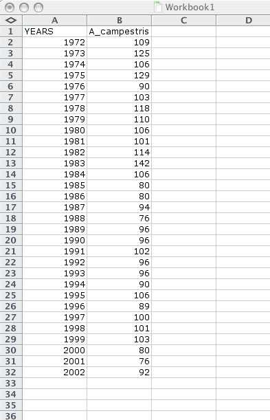
The goal is to make a simple scatterplot of data, like this:
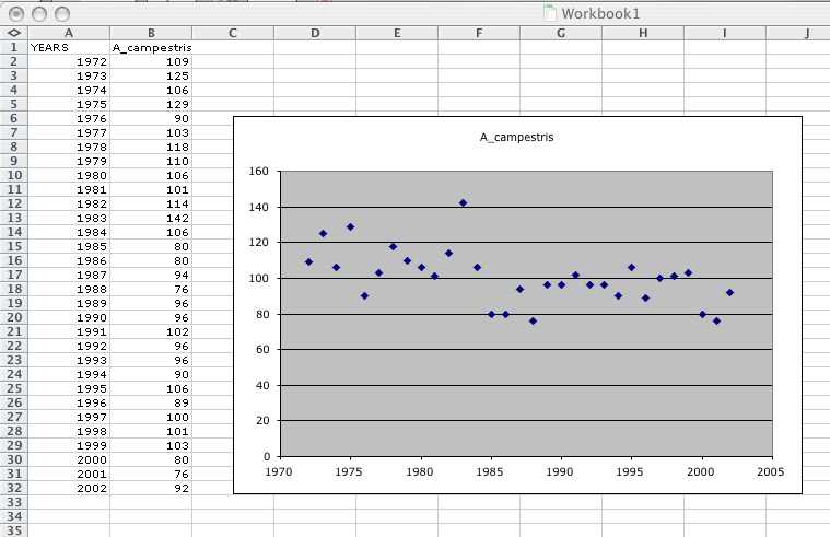
First take the data you downloaded and enter it into excel so you have two columns of numbers, like this:
Next, drag the mouse across your data so that the two columns of numbers are highlighted, then go up to the "Insert" drop down menu and choose "Chart." A menu will come up with many choices for types of graphs. You want "XY(Scatter)".
Once you have chosen the correct graph type, there are a number of options for the presentation of the graph. You can simply accept the defaults, and click "Finish" once you have highlighted the "XY(Scatter)" choice.
If you only have two columns of data in your worksheet (as shown in the picture above), Excel should then give you a graph of your data. Click on different parts of the data to change the way it looks.
II. How to plot a line
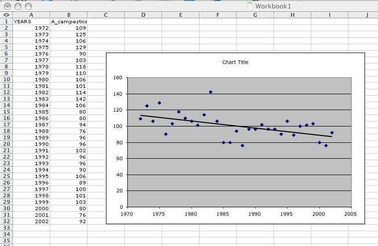
Next we want to put a line on our graph, which will help us better understand the data. Note that the goal is not to connect the dots, but to have a line which essentially shows an average through your data points.
You can add a line like this to the scatterplot you already have by doing the following:
- click on the graph you have made so that it is highlighted
- go up to the "Chart" drop down menu
- choose the "Add trendline" option
- a window will open with a number of graphing options, highlight "linear" and say "OK"
III. How to perform a regression analysis
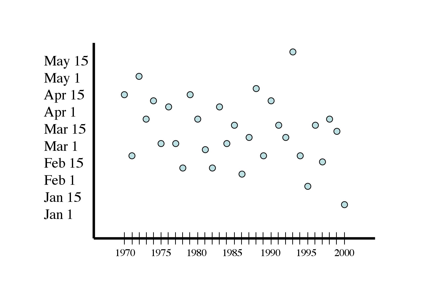
Consider the three graphs below, which all show observations of butterfly phenology plotted against years (each dot represents the date of first flight in one year).
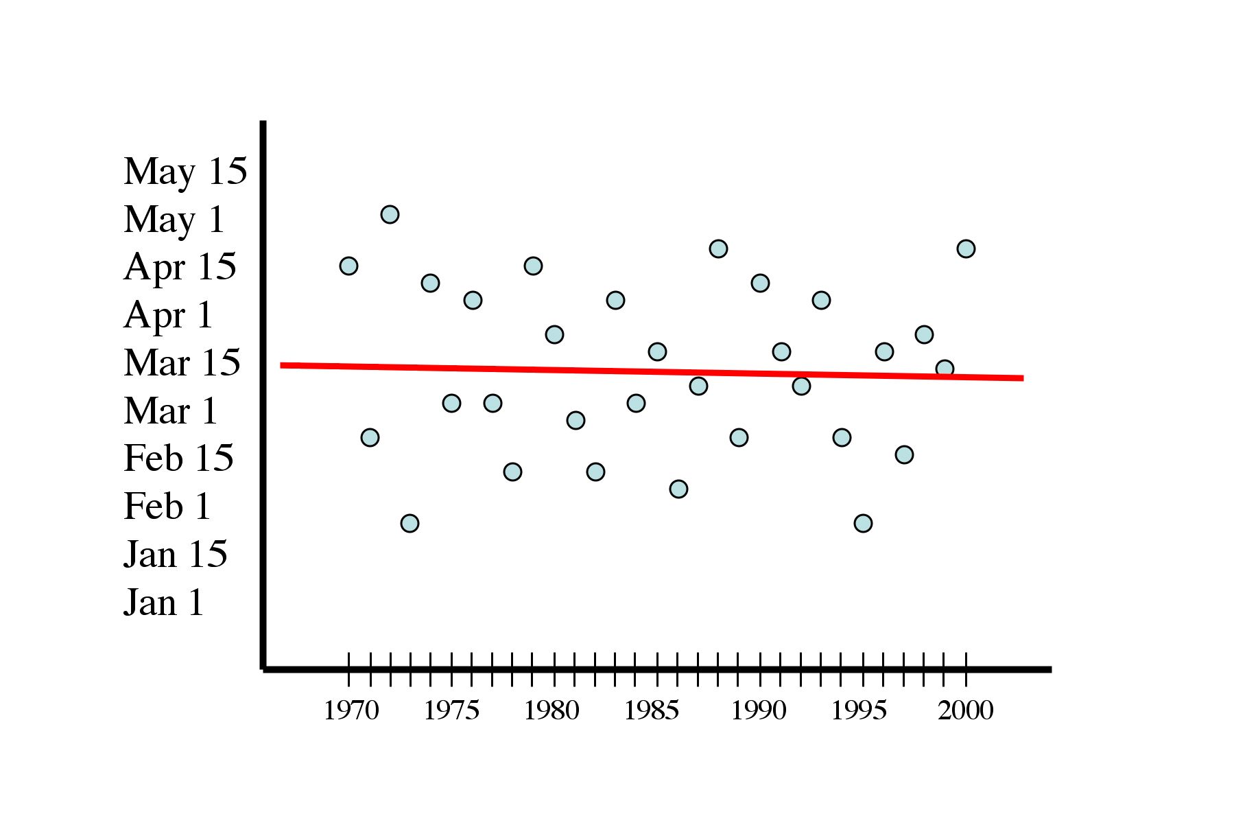
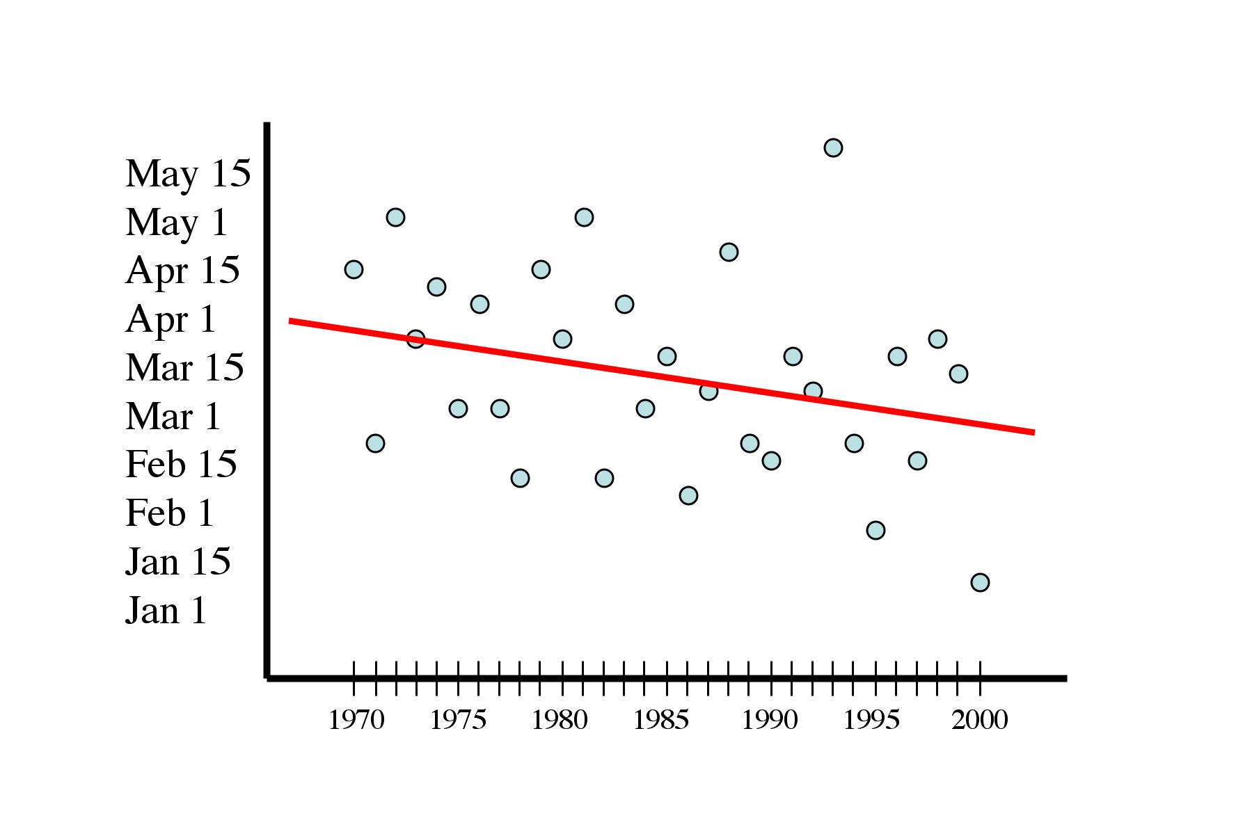
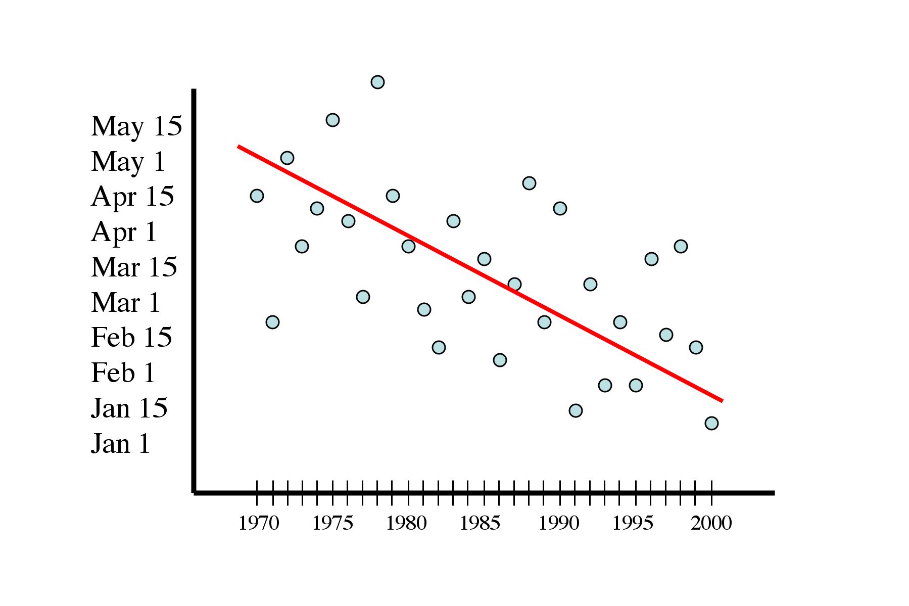
In the first graph, you see a line that is flat. This tells us that averaging across years there is no trend in butterfly emergence. In other words, the butterfly is neither emerging earlier or later over time. Compare that to the second two graphs, in which you see the line sloping down to the right. A sloping line suggests that a butterfly has been emerging earlier over the years (as previously discussed), but the slope of the line is different in those two graphs.
The line is sufficiently steep in the third graph that we might feel confident in saying that the butterfly is really emerging earlier each year. But what about the line in the second graph? It is possible that an early emergence in one or two years might by chance produce a line that sloped down just a bit -- in that case we would not want to conclude that the butterfly was really emerging earlier over time.
How can we distinguish between patterns like those shown in the second and third graphs? There is a subject called statistics which deals with this kind of question. Right now you are going to learn how to make Excel do one kind of statistical test called "regression." Your teacher may suggest other websites where you can learn more about statistics and regression, but for now let's just do the test and read the output.
In Excel, go to the "Tools" menu and look for "Data Analysis." If you don't see Data Analysis, you need to install it: go to Tools again, and choose "Add-ins." You will see a menu of choices, select "Analysis ToolPak."
Now you should be able to find Data Analysis under Tools. Select it (while you have your worksheet open with the data) and you will see another menu open up. Choose Regression. A new window will open with many choices. All you need to do is specify your x and y range... To do that, click in the box next to x range and then move the mouse to your spread sheet and drag across the column of data that you want to be your x data. Do the same for your y data. Then hit OK (you don't need to change any of the other defaults).
You should see something like this:
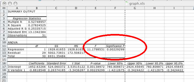
The key part of that result is circled in red (you won't see a red circle on your computer). We call that the "P-value." If the P-value is less than 0.05, we conclude that the slope of the line on our graph is different from zero -- put another way, the butterfly is really emerging earlier or later (depending on which way the line is sloping). If the P-value is greater an 0.05, then we conclude that the pattern we see (perhaps a line with a shallow slope, as in the second graph above), was observed by chance (and is not really different than a flat line).
In summary, the important thing to know here is that if your P-value is less than 0.05 from the data you are graphing, you will conclude that there is a real trend in your data (the butterfly is emerging earlier or later). The same interpretation applies to lines that you will draw through weather data and through a comparison of butterfly and weather data in the final activity.